Before
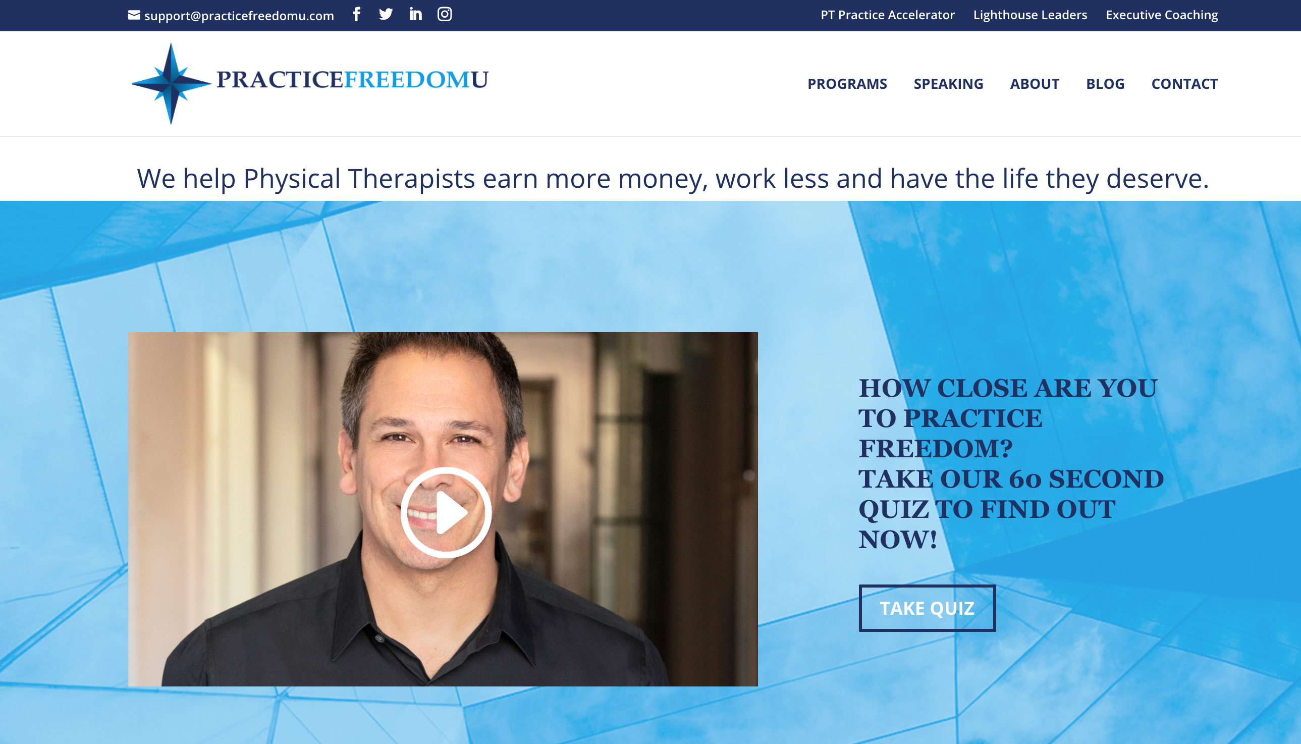
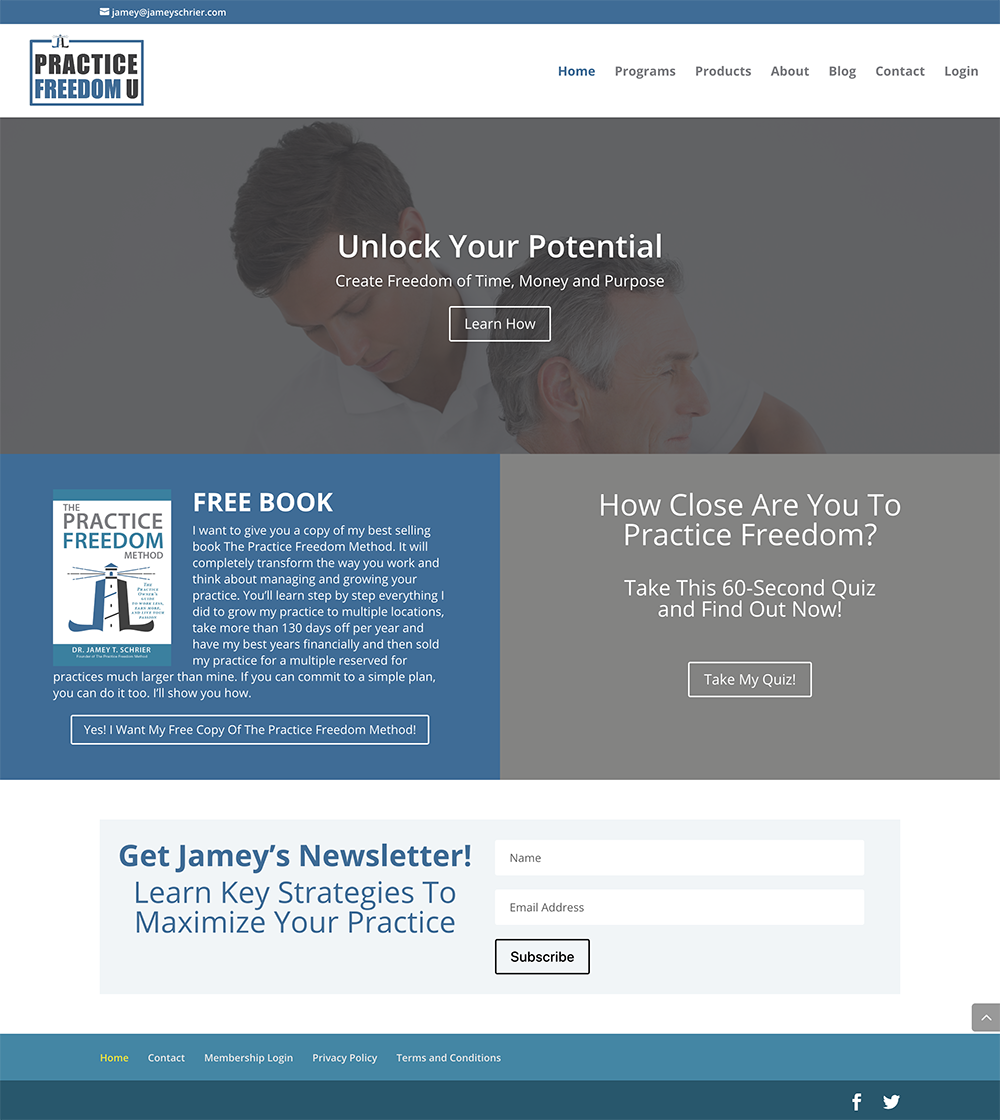
Jamey provides business coaching to owners of physical therapy practices. His old site was bland and outdated, and wasn’t converting well. From the front page, it wasn’t even really clear what the business does. It didn’t mention physical therapists, and it wasn’t clear what “practice” a customer might be trying to get freedom from. The logo was outdated, and incorporated an awkward lighthouse icon with no clear reason how lighthouses are related to physical therapy.
In discussions with the client team, we learned that they did like the blues in the existing site, but just that it felt too dark and grey with the way it was being used on that site.

New Logo
Our revamp began with a new logo, based on the new business name chosen by the client. We started by providing several options in a wide variety of styles and color schemes, since the logo is the basis around which everything else is built. We made sure to include several versions with a brighter version of the blues that we knew the client liked.
They chose this much more modern looking logo, which retains the clients affinity for nautical themes and the compass rose reference, while not being so specific that you would think the company is actually selling lighthouses. The use of some subtle shading gives the logo depth, while the colors give it the right amount of brightness to move away from the older greyscale.
After
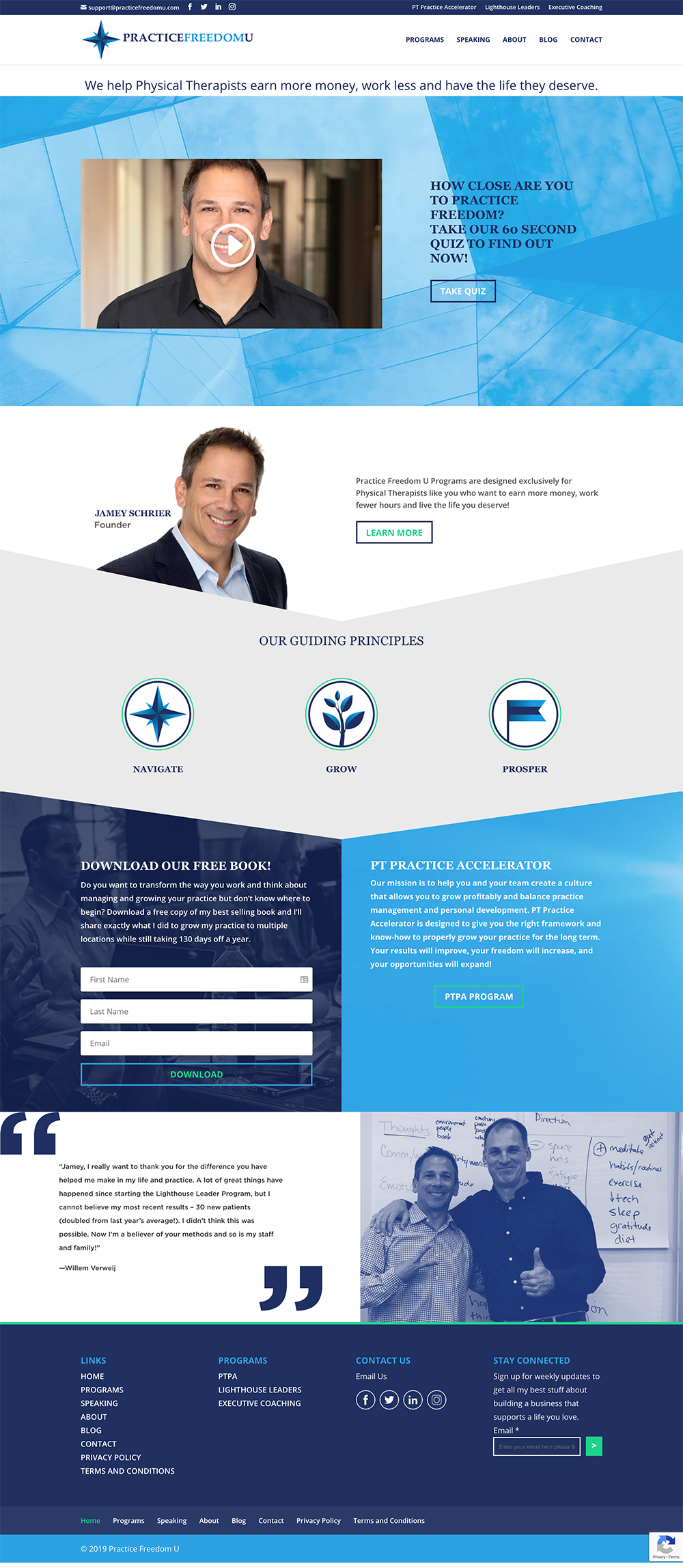
Once the logo was decided on, the rest of the page design flowed from there. We wanted to be sure that the page didn’t feel too “blocky” and that there was a sense of motion that encouraged the site visitor to keep their eye moving down the page, so we incorporated some triangles and other unexpected angles into the site for visual interest and to guide the reader down the page.
We were able to incorporate easy-to-find sections for the Free E-book download, information about specific courses, and a section for the important social proof, all interwoven with information and graphics that make it much more clear what service Jamey offers to the owners of Physical Therapy practices.
Internal Elements
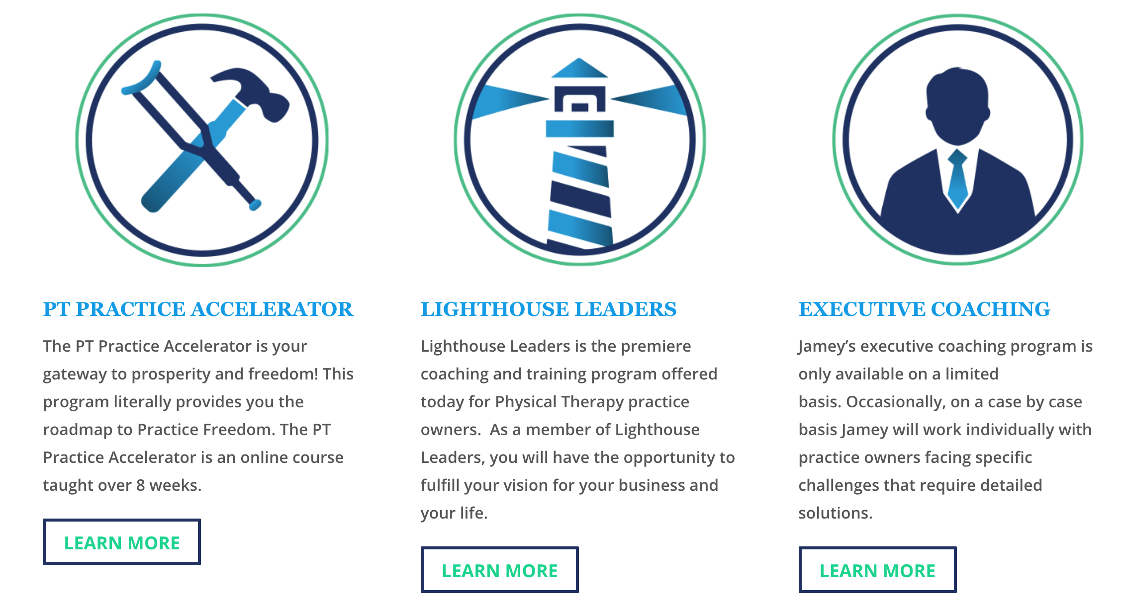
We also added to internal pages a system of iconography used to make the different services more visually consistent, as well as similar icons that are used within the membership site to delineate categories of information.


Recent Comments